ShopDreamUp AI ArtDreamUp
Deviation Actions


Suggested Deviants


Suggested Collections


You Might Like…


![DotW - Too Late 2/6 [collab]](https://images-wixmp-ed30a86b8c4ca887773594c2.wixmp.com/f/89d5f878-0625-470a-b23f-c11d4c91a4af/det7c7i-6df8391f-2303-47ad-abe3-ab74e9b3bed0.png/v1/crop/w_184,h_184,x_0,y_19,scl_0.23650385604113,q_70,strp/dotw___too_late_2_6__collab__by_oneminutesketch_det7c7i-92s-2x.jpg?token=eyJ0eXAiOiJKV1QiLCJhbGciOiJIUzI1NiJ9.eyJzdWIiOiJ1cm46YXBwOjdlMGQxODg5ODIyNjQzNzNhNWYwZDQxNWVhMGQyNmUwIiwiaXNzIjoidXJuOmFwcDo3ZTBkMTg4OTgyMjY0MzczYTVmMGQ0MTVlYTBkMjZlMCIsIm9iaiI6W1t7ImhlaWdodCI6Ijw9MTEwMCIsInBhdGgiOiJcL2ZcLzg5ZDVmODc4LTA2MjUtNDcwYS1iMjNmLWMxMWQ0YzkxYTRhZlwvZGV0N2M3aS02ZGY4MzkxZi0yMzAzLTQ3YWQtYWJlMy1hYjc0ZTliM2JlZDAucG5nIiwid2lkdGgiOiI8PTc3OCJ9XV0sImF1ZCI6WyJ1cm46c2VydmljZTppbWFnZS5vcGVyYXRpb25zIl19.ydM7Wo20ifuEM82dePYWUg860ktlfDkSEO1OaRYlRZM)
![DotW - Too Late 2/6 [collab]](https://images-wixmp-ed30a86b8c4ca887773594c2.wixmp.com/f/89d5f878-0625-470a-b23f-c11d4c91a4af/det7c7i-6df8391f-2303-47ad-abe3-ab74e9b3bed0.png/v1/crop/w_92,h_92,x_0,y_10,scl_0.11825192802057,q_70,strp/dotw___too_late_2_6__collab__by_oneminutesketch_det7c7i-92s.jpg?token=eyJ0eXAiOiJKV1QiLCJhbGciOiJIUzI1NiJ9.eyJzdWIiOiJ1cm46YXBwOjdlMGQxODg5ODIyNjQzNzNhNWYwZDQxNWVhMGQyNmUwIiwiaXNzIjoidXJuOmFwcDo3ZTBkMTg4OTgyMjY0MzczYTVmMGQ0MTVlYTBkMjZlMCIsIm9iaiI6W1t7ImhlaWdodCI6Ijw9MTEwMCIsInBhdGgiOiJcL2ZcLzg5ZDVmODc4LTA2MjUtNDcwYS1iMjNmLWMxMWQ0YzkxYTRhZlwvZGV0N2M3aS02ZGY4MzkxZi0yMzAzLTQ3YWQtYWJlMy1hYjc0ZTliM2JlZDAucG5nIiwid2lkdGgiOiI8PTc3OCJ9XV0sImF1ZCI6WyJ1cm46c2VydmljZTppbWFnZS5vcGVyYXRpb25zIl19.ydM7Wo20ifuEM82dePYWUg860ktlfDkSEO1OaRYlRZM)


Featured in Groups

Description
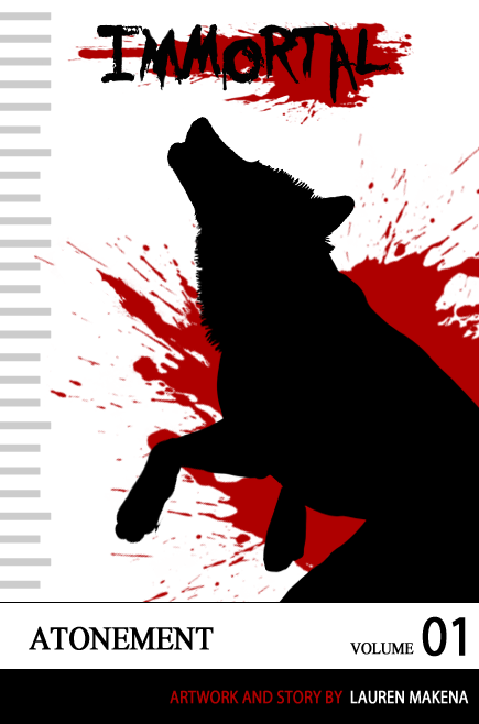
Sorry guys, this is not a real new comic. 
I made this fairly quickly as something else to get the animal comic world thinking more creatively. I see a lot of covers that are merely echoes of other animal comics.
I think there are plenty of ways you could get creative with making a cover. Surprisingly, despite the love of manga, I see very few manga-themed covers. This isn't to say that this is the way you should do things, but just simply an example.
IMO, a cover should be something that stands out but -also- reflects what is inside. Don't make the cover TOO different from the artwork inside, or you will throw people off depending on what the cover was. :/
Don't ever ever have someone else draw the cover (UNLESS it is representational...I'm sure this cover here would work for any style artwork). This was named as the #1 pet peeve of comic lovers in polls I read about cover artwork. Especially when the cover artwork was better than what was inside.
It should have at least a loose theme. My theme was close ups of characters faces drawn in a painterly style. When you set all of my covers together, they will look like they -belong- together. I drew this cover as another example of a themed cover. If I were to make this series, each issue (the first being atonement, second similarly named), and all featuring a black and red cover...with a new wolf silhouette drawn in each time.
You don't have to go wild with covers, simple ones will do. (Smile)")
Mostly, get creative with the text layout! I see a lot of covers with the title and author's name at the bottom and/or top. This isn't wrong, but just know it isn't the only choice!")
Immortal copyright to
I made this fairly quickly as something else to get the animal comic world thinking more creatively. I see a lot of covers that are merely echoes of other animal comics.
I think there are plenty of ways you could get creative with making a cover. Surprisingly, despite the love of manga, I see very few manga-themed covers. This isn't to say that this is the way you should do things, but just simply an example.
IMO, a cover should be something that stands out but -also- reflects what is inside. Don't make the cover TOO different from the artwork inside, or you will throw people off depending on what the cover was. :/
Don't ever ever have someone else draw the cover (UNLESS it is representational...I'm sure this cover here would work for any style artwork). This was named as the #1 pet peeve of comic lovers in polls I read about cover artwork. Especially when the cover artwork was better than what was inside.
It should have at least a loose theme. My theme was close ups of characters faces drawn in a painterly style. When you set all of my covers together, they will look like they -belong- together. I drew this cover as another example of a themed cover. If I were to make this series, each issue (the first being atonement, second similarly named), and all featuring a black and red cover...with a new wolf silhouette drawn in each time.
You don't have to go wild with covers, simple ones will do.
Mostly, get creative with the text layout! I see a lot of covers with the title and author's name at the bottom and/or top. This isn't wrong, but just know it isn't the only choice!
Immortal copyright to
Image size
435x658px 83.85 KB
© 2011 - 2024 akeli
Comments49
Join the community to add your comment. Already a deviant? Log In

